Warning : The following post contains nudity/adult content.
This one I stumbled upon purely by a stroke of luck, but boy am I glad that I did. While sightseeing on our bicycles in Kyoto near Kamogawa river, we stepped into a trendy bookstore during lunch and there was a mini manga exhibition going on. (see image below)

I looked through the work on display and took a liking for it almost immediately. The illustration style was clearly that of the early Showa era, but the artist’s work displayed a keen understanding of graphic design, composition and layout, complimented by his simple, yet elegant style of drawing.


The artist was Kamimura Kazuo. I was then not familiar with his name as yet, but I remember seeing his work somewhere before. That work turned out to be Lady Snowblood, written by Kazuo Koike and illustrated by Kamimura. Lady snowblood is one of the artistic influences behind Tarantino’s Kill Bill.
(below) Some of the artist’s commercial work for the soda Royal Crown. His training in advertising illustration probably helped hone his skills as a manga artist.


(above & below) Various manga covers and panels. I love the simplicity of his line work.


The book is published by Mandarake ( yes, that same Mandarake store in Nakano Broadway ) and comes in a sturdy, beautiful hard cover that is perfect for browsing. Highly recommended.
Lyricism – The World Of Kamimura Kazuo Art リリシズム―上村一夫の世界 作品集 Book details :
– Dimensions – 11.9 x 8.5 x 1.1 inches
– Hard cover, 336 pages ( 184 colored )
– Color and B&W, in Japanese

Buy From Amazon.com | Amazon CA | Amazon UK | Amazon FR | Amazon IT | Amazon DE | Amazon ES
You might also be interested in these items :
18


 Flowers Of Evil – Kamimura Kazuo Manga Book Review
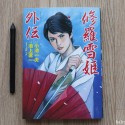 Tales Of Lady Snowblood Manga Review
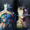 Ikegami Ryoichi Art Works Book Review
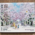 The Second Movement – Fukushima : Kazuo Oga Art Book Review
 Akita, Asobi No Fukei – Kazuo Oga Art Book Review


April 28th, 2013 at 11:50 pm
great find, Vong! i love Lady Snowblood, and seeing his other work, especially the advertising stuff, puts his work in perspective and makes a lot of sense. i will need to pick this one up for sure.
April 29th, 2013 at 3:13 am
Zack : I thought you might find this to your taste. :]
April 30th, 2013 at 10:44 pm
he just has such great design sense. especially what looks to be soft drink ads, they’re wonderful. his work is so clean, and it makes sense that his layout sensibilities are so strong in his comics.