Criterion Designs is a superb collection of classy art work from the vaults of film distributor Criterion Collection, well known for its exquisite and high quality releases of classic and contemporary films.
Criterion commissions top designers and artists to create art work for each film cover, and the results are tasteful amalgamations of art, graphic design and typography, all the while staying true to the spirit and look of the original film.
The pictures below represent only a handful of the huge collection of art work featured in the book, collating some 30 years of art & design work with commissions from almost 100 guest artists.


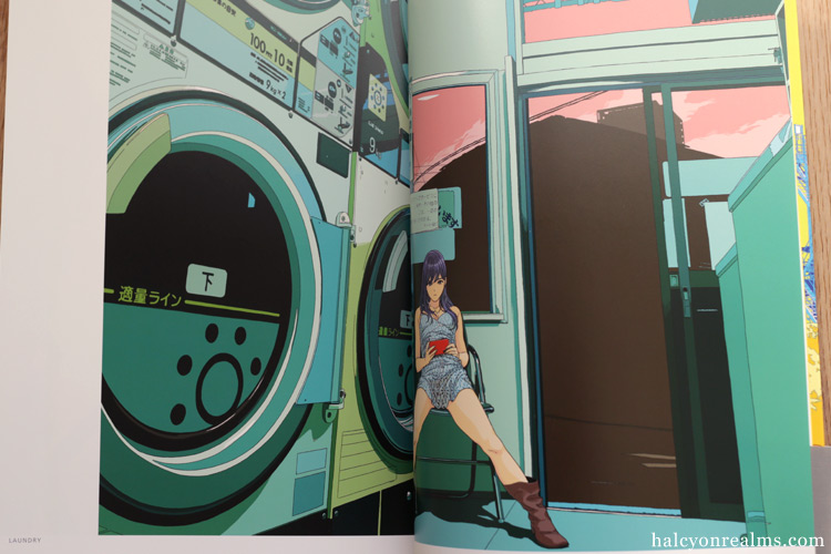
(above) The book includes numerous gatefold page spreads featuring a more expansive version of the art work created for the films. (below) I also enjoy pages like these showcasing the sketch studies and variant designs.


(above) Illustrations for Wes Anderson’s films Rushmore and The Royal Tenenbaums by artist Eric Chase Anderson. The Royal Tenenbaums is my favourite Wes Anderson film – read the review for the Criterion blu-ray here.
(below) Art work for Lord Of The Flies by Kent Williams, who was also comissioned to create the art work for Rashomon. Also check out his art book Amalgam.


(above) Cover designs for Krysztof Kielowski’s film trilogy Three Colors, one of my favourite French films of all time.


Criterion Designs is not only a celebration of great cinema, art and design but also serves as a fantastic film recommendation list, of which I’ve only seen a handful. I fully intend to rectify that. With regards to the book, I give it my highest recommendations.
“Criterion Designs″ book details :
– Dimensions – 1.5 x 10.2 x 13.5 inches
– Hard cover, 306 pages
– Full color

Buy From Amazon CA | Amazon UK | Amazon Japan | Amazon FR | Amazon IT | Amazon DE | Amazon ES
You might also be interested in these items :
23


 The Royal Tenenbaums Criterion Blu-ray
 The Wes Anderson Collection Book Review
 Y Tu Mamá También (Alfonso Cuarón) Criterion Blu-ray
 Beauty In Symmetry, Wes Anderson Style.
 Manga Design : Book Designs For Japanese Comics Book Review


December 16th, 2014 at 11:50 pm
Wow. The book looks really good sia.
December 17th, 2014 at 12:51 am
On the wish list
December 18th, 2014 at 10:17 am
The only problem with this is that sometimes the designs are too good for the film itself: some of these old films’ plots aren’t as meticulously paced or their cinematography is not as good. The characters’ features and characteristics are often exaggerated to the point of disruption. I often have high expectations of a film when I see that its disc cover is beautifully and intricately designed. And then I become disappointed.
December 18th, 2014 at 9:33 pm
Cover designs from early (but I mean really jurassic) video games, worked under the same premise & promise: what You see is clearly NOT what You get. This book collects nothing but an homage to films, an amazing rendition from the graphic design viewpoint for the sake of renewing the appetite for the cinematic experience.
December 19th, 2014 at 1:58 am
yeah, im gonna have to get this.
December 19th, 2014 at 11:40 pm
Ray – Ha ~
DISTRAKT/martin – Yes. 😛
Petit Orenji – I understand what you mean. 😛 Personally I like to remind myself that just because I don’t like a film doesn’t make it bad, because film, like most form of are are so subjective. Also, tastes tend to change with time.
nyuudo – Nicely put, especially in your last sentence. :]