Anime director Mamoru Hosoda’s latest film Wolf Children ( Ookami Kodomo No Ame To Yuki ) is not only one of the best movies I’ve seen this year, but the art book is positively one of the most spectacular; not just in quality, but in quantity too. Running at close to 300 pages, the contents are in-depth and very comprehensive – I’m breaking up the review into 2 parts to better showcase the amazing art work, starting with the background art.


I think the book reproduces most, if not all the background plates used in the film. Each plate is annotated by its scene and cut numbers, as well as a small paragraph of production notes. ( in Japanese only ) Art direction was supervised by Ono Hiroshi , co-founder of background art studio Fuuga.


(above and below) Sights like this are usually re-produced using photographic references from actual locations in Japan, as the creators did in The Girl Who Leapt Through Time. Check out this, this and this posts. This bond to reality establishes a sense of familiarity and connection, enhancing the emotional resonance of the scenes.


(above) Digital mattes are also used in the creation of Hana’s main household in the mountains, where the principal characters spend a significant amount of screen time in. The digital background and set allows the filmmakers better control of camera angles and composition, which can be manipulated in 3D space. More details on the artistic/technical approaches are discussed in the book.


(above right) While not explicitly stated, I would like to think this shot is a nod from Hosoda-san to Miyazaki’s Totoro.


In summary, this book is a steal. With so much content, the publishers could have easily split the background art and layout/character design into 2 different books, increasing their profit, but they generously included everything in this one hearty volume. I highly recommend interested parties to pick up the book before it goes out of print.
I’ll cover the layout/character design and more in Part II.
“Wolf Children (Ookami Kodomo)” art book details :
Dimensions – 29.6 x 22.8 x 2.8 cm
Soft cover, 285 pages
Full color/ B&W, in Japanese

Buy From Amazon.com | Buy From Amazon CA | Buy From Amazon UK
You might also be interested in these items :
29


 Wolf Children Art Book Review Part II : Layout And CG
 Wolf Children Storyboard Book Review
 Animestyle Magazine Issue 1 – Wolf Children Special
 The Wolf Children – Mamoru Hosoda’s Upcoming Anime
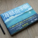 Children Of The Sea Background Art Book Review


September 11th, 2012 at 5:35 pm
How beautiful.
I agree with you that reproducing real places has a special meaning. These artists have the “magic touch” to turn ordinary places into poetic, charming sceneries, they can feel the beauty of everyday life.
I realize that you say “more details on the artistic/technical approaches are discussed in the book”, but could you please give us some basic information for people that can’t read japanese? Are the backgrounds painted with the usual gouache/watercolor paint? Thank you.
September 12th, 2012 at 1:57 am
Mario – I’ll browse through the book to look for more information. :]
September 12th, 2012 at 8:43 pm
Maybe I can answer for Mario’s question.
Japanese animation Background painters use water-soluble paint called Poster Colour in Japan nd U.K. or Poster Paint in U.S. They’re inexpensive opaque paints used by children. You can buy them from local art & craft store for very low price.
In Japanese productions, watercolor and gouache paints are not used widely because they’re expensive and only come in small quantity. What you’re seeing is technical skill of Japanese BG artists utilizing cheap paints to greatest effect.
More animation BG artist have been using digital, but older artists still use paints.
September 13th, 2012 at 5:11 pm
Henry, thank you for your answer.
I’ve read something similar in an interview to Kazuo Oga, if I remember well. I was wondering if the backgrounds for Wolf Children were still made with traditional paint, or someting else (like digital).
Regarding poster paint vs gouache, I’m not sure the paint used in japanese animation studios is really like the poster paint sold here in Europe. I’ve tried a couple of brands, but they are REALLY REALLY bad (not enough opaque, horrible mixing properties, etc). I may try some different brand, though.
I don’t want to undervalue japanese artists: whoever makes those backgrouds, with whatever technique, is a true master. But they clearly must be using some decent paint.
September 16th, 2012 at 6:05 pm
Mario,
Honestly, I haven’t tried European brand poster colour/paint. So I can’t tell you which brand creates opaque looks. However, there are Youtube videos of non-Japanese artists who use poster colour to create opaque landscape painting. Ask them what brand they used.
Japanese use locally produced poster colour/paint that can be bought in local art/stationery stores at low price.
Nicker Poster Colour
http://www.nicker-enogu.com/product/product-pc.html
Japan is not high tech as it may appear to be, especially traditional animation industry. Some of them do use digital to create backgrounds, but they’re still grounded to traditional methods. I don’t have Wolf Children art book yet, but I have feeling that they used both traditional and digital methods. Easiest way to find out is to look closely at a picture for brush marks and paper texture.
One of the well-known digital painting studio is Kusanagi and yet, it has wonderful links on how paint traditionally using poster colour in Japanese.
http://www.kusanagi.co.jp/howto-/howto.htm
Kusanagi did BG designs for some of Final Fantasy franchise and popular anime titles.
September 19th, 2012 at 5:15 am
When/where did you get to see Ookami no Kodomo?
I’ve got my tickets for the UK premiere (first tickets I bought when the booking for the London Film Festival opened – ahead of all the other eight or so films I booked for!), can’t wait. 🙂
September 19th, 2012 at 11:13 pm
alua – A local film distributor had the good taste of bringing in limited screenings so I made a beeline for it. :]
I’m looking forward to reading your review ( with a link here, of course ) of it.
October 22nd, 2012 at 2:26 pm
I can also say quite a bit about Japanese Poster colour. I have been an Oga Kazuo fan for quite a while now, and I’m also an art student. I am mainly a digital artist when it comes to painting, but I’ve always loved Kazuo’s paintings, and decided I wanted to do something of the kind. I then proceeded to find the actual paint he used, becaus I knew watercolours couldn’t achieve that opaque feeling and that low quality gouache could never look so bright and vibrant. I found only Nicker Poster Colour (the brand that Oga uses) and Sakura Poster Colour, both only sold in Asia. Poster colour is not cheap at all, it’s only cheap when compared to very high quality watercolour and gouache, but it is still a high quality material (so don’t be fooled). Actually buying it from Japan it’s incredibly expensive and simply isn’t worth it, not to metion it’s not exported because it’s inflamable. And no, European ‘poster color’ is nothing of the sort, that’s just cheap water with pigment, for children.
My point is, japanese poster color is a good quality product that’s not as cheap as commonly stated, and that allows users to use it both as watercolor and gouache depending on how much water they add, always giving vibrant colors and tones that couldn’t possibly be achieved through use of lower quality materials.
October 23rd, 2012 at 2:10 am
@Alexndre
Since you bought and used it, then I have nothing much else to say. I never knew that they’re flammable
It’s my fault that I assumed too much on poster color.
Did you imported or did you bought them directly while in Japan?
I thought 4400 yen for 12 color set of 40 ml jars would be cheaper than 12 color set of 15 ml high quality gouache tubes, in terms of quantity.