

The Mood Is Already That Of War ( Kibun Wa Mou Senso ) is a manga written by novelist Yahagi Toshikiko, and art work by Akira director Otomo Katsuhiro. First serialized in Futabasha’s Action Comics in 1982, the 13 short stories are now compiled into this single volume tankobon.


The stories revolve around fictionalized accounts of military conflicts and battles taking place along the Sino-Russian border, many of them influenced by real world events taking place during the cold war era of the early 1980s. Some of the narratives also include parodies of characters that were then appearing in the highly popular Japanese magazine Popeye.


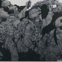
(above & below) Otomo has often been described as one of the first ( and indeed few ) manga artists whose drawings of human faces accurately portray the visual distinctions between Asians and Caucasians, a pretty remarkable feat and a testament to his incredible powers of observation.


Otomo’s quality of art work in the manga is consistently good, and we can already see his signature style of dynamic action/speed lines, cinematic staging and framing of panels, as well as massive and highly detailed action pieces (below) that will soon explode unto the manga world in a new piece of work titled “Akira”.


The war genre might be of limited interest to some, but Otomo’s art work is impressive throughout the book and definitely worth checking out.
The Mood Is Already Of War – Otomo Katsuhiro Manga 気分はもう戦争 大友克洋 漫画” book details :
– Dimensions – 8.3 x 5.9 x 1 inches
– Softcover, 334 pages.
– B&W, in Japanese language
Note : There is also a deluxe edition which is of a bigger print size ( identical to the Akira manga ), but this is out of print. Used copies can be purchased on Amazon Japan here.

Buy From Amazon.com | Amazon CA | Amazon UK | Amazon FR | Amazon IT | Amazon DE | Amazon ES
You might also be interested in these items :


 The Mood Is Already Of War 3 – Otomo Katsuhiro Manga Review
 New Katsuhiro Otomo Manga – The Mood Is Already Of War Sequel
 Farewell To Weapons – Otomo Katsuhiro Manga+Art Book Review
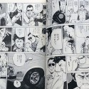 Good Weather – Katsuhiro Otomo Manga Review
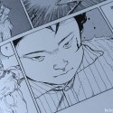 Domu Deluxe Edition – Otomo Katsuhiro Manga Review


")


![The Architectural Design Of Ghibli - Casa Brutus Magazine Review Casa BRUTUS(??? ?????) 2022? 12??[???????????????] ??? ????](http://halcyonrealms.com/blogpics/casabg29.jpg "The Architectural Design Of Ghibli - Casa Brutus Magazine Review Casa BRUTUS(??? ?????) 2022? 12??[???????????????] ??? ????")


July 10th, 2014 at 9:04 am
Otomo really rocks in the military genere,well even “Stink Bomb” itself looks like a Evangelion cut-out scene of Nerve attacking an angel.Some times, makes me remember of the artwork made to the “Metal Slug Series” that kind of funny/hilarious stuff.It’s delightful how he ilustrates (and the quality of meticulous details)military and own concepts of guns,aircraft,etc…Well after all, he is Otomo. Sorry, i’m a big fan, long live Sir-Otomo-sama!!.
July 10th, 2014 at 9:46 pm
Alejandro – Totally agree, I’m a big fan too. I think it’s easy to take for granted by his art work is really detailed. :]
July 11th, 2014 at 2:41 am
This was maybe the first Otomo book I ever got after Akira and Domu, and it is still probably my favorite. I love his early work, and this was also one of the first Japanese language books I ever bought. Even not being able to read the words, I could immediately tell how special it was. Not only the detail in his lines, but the way he told a story; Otomo-sensei is so strong a graphic storyteller, that even without some of the finer dialogue, it’s impossible to get lost on his pages. Plus, his paneling is second to none; you can basically draw a line through his pages where your eye is supposed to follow. I could write for hours about his work, and I know I have on pretty much every other Otomo post on Halcyon Realms, but I’ll conclude that this book, along with Akira, probably changed my life.
July 11th, 2014 at 2:43 am
Also, I did a very short piece (get it?) on Otomo’s early work on Gaikoku no Oni, for anyone interested (http://foreigndemon.blogspot.com/2013/10/a-short-piece.html)
July 12th, 2014 at 1:27 am
Zack – Spot on about Otomo’s amazing skills as a graphic storyteller; I’ve read many manga with fantastic art work but few have the cinematic narrative impact of Otomo – and he utilizes it to sublime effect in the anime version of Akira.
July 12th, 2014 at 5:34 am
I love Otomo’s work, and I know this question is a bit random, but, I’m having a hard time deciding wich manga version of Akira is better-the color version, or the black and white version? I don’t know which one to collect(sorry for being off topic).
July 12th, 2014 at 12:04 pm
Christopher – This is not an easy question to answer mostly because it is so subjective. The colored version does bring a different dimension to the art work but personally I find the colors a little to garish and in the way of the line work. In summary, I prefer the original B&W version. :]
I’ll be interested to hear what the other guys think. :]
July 14th, 2014 at 4:45 pm
If you compare comics originally made in B&W, with others originally made in colors, yes, I agree, it’s subjective which one you prefer. But when a B&W comic is colored, you can positively say that the original is better: a book in the original language is always better than any translation, isn’t it? Color completely changes the balance of the pages.
July 14th, 2014 at 5:56 pm
Kibun Wa Mou Sensou comic panels are sublime. This book is one of my Otomo’s favorites, alongside with Hansel and Gretel, Domu and AKIRA.
If anyone intends to buy the book, I advice to choose this edition, which have greater dimensions than the tankobon. The exceptional panels deserves it (B5 size, same as AKIRA original books):
http://www.amazon.co.jp/%E6%B0%97%E5%88%86%E3%81%AF%E3%82%82%E3%81%86%E6%88%A6%E4%BA%89-%E8%A7%92%E5%B7%9D%E3%82%B3%E3%83%9F%E3%83%83%E3%82%AF%E3%82%B9%E3%83%BB%E3%82%A8%E3%83%BC%E3%82%B9%E3%83%BB%E3%82%A8%E3%82%AF%E3%82%B9%E3%83%88%E3%83%A9-%E7%9F%A2%E4%BD%9C-%E4%BF%8A%E5%BD%A6/dp/4047133876/ref=sr_1_3?s=books&ie=UTF8&qid=1405327239&sr=1-3&keywords=%E6%B0%97%E5%88%86%E3%81%AF%E3%82%82%E3%81%86%E6%88%A6%E4%BA%89
July 14th, 2014 at 10:23 pm
Mario – Much agreed. This just made me wonder about the US colored versions of Akira – who decided what colors to use ? I don’t think Otomo had any hand in it at all.
ATOM – Thanks for the link ! I believe I’ve seen this in 2nd bookstores in Tokyo before too, why didn’t I get it ? Haha.
July 14th, 2014 at 10:59 pm
Black and white, all the way.
I agree that the colors are too garish; even in the film, despite the number of colors used, they are still much more subdued. It’s important to remember that the colored version was done specifically to sell the black and white book for a foreign audience, and although the process Steve Oliff created for it was brilliant (and would be the basis for how American comics would then be colored, changing the traditional process forever), Otomo’s analogue approach to his comics feels much more rewarding in the final read (take a look at any of the behind the scenes stuff in Otomo’s recent art book, Genga, or any of the magazines out at the that time to see paint washes and tape lines). I find black and white comics to have more imagination to them sometimes, also. I love deciding the color palette in my mind, and maybe a reason I didn’t like the colors on the page was that they didn’t match the ones in my own head.
July 15th, 2014 at 11:51 pm
Yonghow – According to these sites, Otomo sent to Oliff some colored pages as guidance for his work.
http://otomblr.tumblr.com/post/17921909313/tentativelytitled-this-is-an-extremely-rare
http://1.bp.blogspot.com/-mitquW4jGws/TuJO2NGCEOI/AAAAAAAAB40/m5JacZEE-fo/s1600/IMG_0427.JPG
July 16th, 2014 at 1:04 am
zack – Looks like you answered my question again; regarding the person behind the colored version of Akira – was this Steve Oliff a comic artist himself ?
While we’re still on the subject of colored works I’ve always enjoyed Otomo’s own painted pieces, often for select pages only. His technique of muted watercolors/gouache bears unmistakable resemblance to that of the late Moebius.
Atom – Wow ! I’ve never seen these, thanks ! The Japanese text on the 2nd image reads – “test for overseas (edition) use”.
July 17th, 2014 at 9:29 am
I love Otomo’s paintings, especially his Harmageddon stuff. Again, my real issue with the colored work on Akira, or any similar case, is that it’s often an afterthought, and Akira is so strong, despite the limitations that were probably presented by being published in a B&W anthology (though as it’s pretty common practice in Japan, and full color work is more rare than anything else, limitation might not be a fair word). I know that Otomo has made some references in the past to having the covers of each volume be an allusion to either an American or European style comic, so perhaps having the colors in there is what he originally wanted? I honestly don’t know and am merely speculating, but I mean, if he was participating in the coloring with Oliff, it couldn’t have been something he was really against; though again, perhaps it was just part of the game that he had to play to have his work released in English.
Also, as far as I know Oliff didn’t do too much work outside of coloring. My own research has only come up with a small handful of inking jobs, and an even smaller handful of penciling and writing jobs, though I think he did do the od cover here and there. His real work was in both the actual coloring of the books as well as helping to develop the process by which now basically everything’s done in American comics.